City of Vaughan
BrainStation UI Design 2020
For the final UI design project for my course I decided to redesign the City of Vaughan’s website.
The Problem
When I was deciding on developing a new UI for my course project I thought a lot about the poorly design interfaces I have come across in both my work and personal life. Having worked in the public engagement environment for a few years, I have noticed that most government websites are not that appealing, both visually and functionally. At the time that I was considering what to design for this project, I remembered that a friend of mine who worked for the City of Vaughan had complained to me in length about how frustrating it was to navigate the website. So I thought, just how bad could it be? Once I took a look at the site, I understood what she meant.
The City of Vaughan’s current website looks outdated and the ease of navigation definitely falls short. The website is overly complex with the amount of content present in the pages and how it is organized. The menu design and general user interface for the site poorly laid out.


moodboard and sketches
When considering a new layout design, I thought a lot about the purpose of a municipal website, the intended users and what their potential needs may be for looking into their city’s webpage.
Government websites are used to share important information and therefore it is inherently heavy in content. This is inevitable, as per numerous regulatory reasons government bodies are required to share a fair amount of information with the public. However, there must be a better way of organizing the content in a more functional manner for the user.
Upon examining the current layout of the website there seems to be some indication (e.g. hero image and CTA) that news of community events, and infrastructural activities are potentially common topics users search for. These various details are things I considered when I began to develop my moodboard.
I looked at various webpage designs specifically focusing on layouts for pages that are heavy in content but still functional and organized for its users. In addition, I decided to also create some custom illustrations and rebranding to help bring together a more cohesive look and feel for the City.


Wireframes
After finalizing my sketches I proceeded to develop the wireframes for the new website on Figma. When finalizing my sketches and moving into the wireframing stage I wanted to primarily reorganize, restructure and de-clutter the amount of content from the original site.


Prototype
When I completed finally completed the wireframes, I moved onto developing the hi-fi mock up and protoype.
About the Design
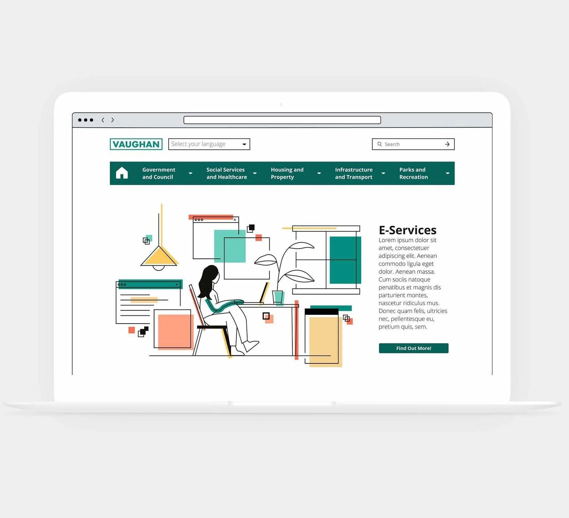
When it came to developing the prototype utilized the colours in an intentional way for the buttons. For all the hero images that have an accompanying CTA; these buttons are all in teal, with the secondary buttons identified by the inverse colours. The only exception would be the “E-Newsletter” subscription button at the bottom of the landing page. This was done intentionally because when I thought about what the biggest takeaway for the user and the intent of the website from the City’s perspective it would be for people to “Be Informed”. This particular section is in yellow to help draw the user’s attention to this CTA.
With the navigation bar I intentionally used a light grey for the hover state of each menu item as it provides a more apparent contrast against the teal. It is very clear to the user which menu item they are hovering over. In addition, when considering the users that may utilize the website I decided to add a language button at the top of the page with the main languages spoken by Vaughan’s demographics.
Last but not least, I added custom illustrations for some of the main menu pages to help bring together a more cohesive branding and feel to the website.


Lessons Learned
While the project was a challenge, I did have a lot of fun creating a new UI and I learnt a number of things along the way throughout various stages of the process.
Wireframing and Hi-Fi Mockup
At the onset of the wireframing stage, I thought I had a clear idea about how to organize and layout the content. When I moved onto the hi-fi mock-up stage I realized some of my wireframe designs didn’t make sense. Some of the content pages could have been consolidated into other sub-categories within the main options. I realized that I needed to think more critically about the user flows.
I also encountered challenges with colour and accessibility at the hi-fi mockup stage as well. Despite initially testing the colours for accessibility, my lack of consideration for how the colours would be utilize eventually rendered my original colour choice inaccessible. I had to reconsider my colour selections because I wanted to use them for text and the original colours were too light to be used as standalone text. Interestingly, it was also during the hi-fi mockup stage that I realized the spacing for the elements and content on the pages were a bit too tight. When I began adding in colours I could see the contrast between the page elements more clearly clashing, especially when I began to think about how to use colour in an intentional manner.
Prototyping
I found the prototyping stage the most challenging as I struggled with determining types of interactions and level of complexity to prototype. I feel that if I had thought more critically about the interactions, and developed a style guide earlier on it would make this process easier.
Take 2!
I think if I could re-approach the project again knowing what I know now having gone through the UI design process, I would definitely like to look at conducting some user testing to gather some feedback on the use of the redesign website and go through several more design iterations to address potential issues with the current redesign. I think would spend more time planning, refining the user flows, creating a more consistent pattern of components and to think more critically about the types of interactions on the website. The next goal after these things are sorted out would be to design a responsive version of the website as it will challenge me to look at the constraints and re-organization of the content on a smaller screen size.